VFX | Adding things for my idea | Part 2
The Wolf of Wall StreetIt is a 2013 American biographical black comedy crime film directed by Martin Scorsese. The screenplay by Terence Winter is adapted from the memoir of the same name by Jordan Belfort and recounts Belfort's perspective on his career as a stockbroker in New York City and how his firm Stratton Oakmont engaged in rampant corruption and fraud on Wall Street that ultimately led to his downfall.
Here I was, sitting at the desk and drawing circles around this title. I did not know where to start and I basically did a brainstorm. Draw things that I could relate to this film. I watched a documentary about the real wolf of Wall street who has represented in this adventure movie.
Okay...
I was ready to draw all props in illustrator... BUT
before that, I promised myself to find music. A soundtrack that works together with the time when these events that are represented in a film happened.
I chose
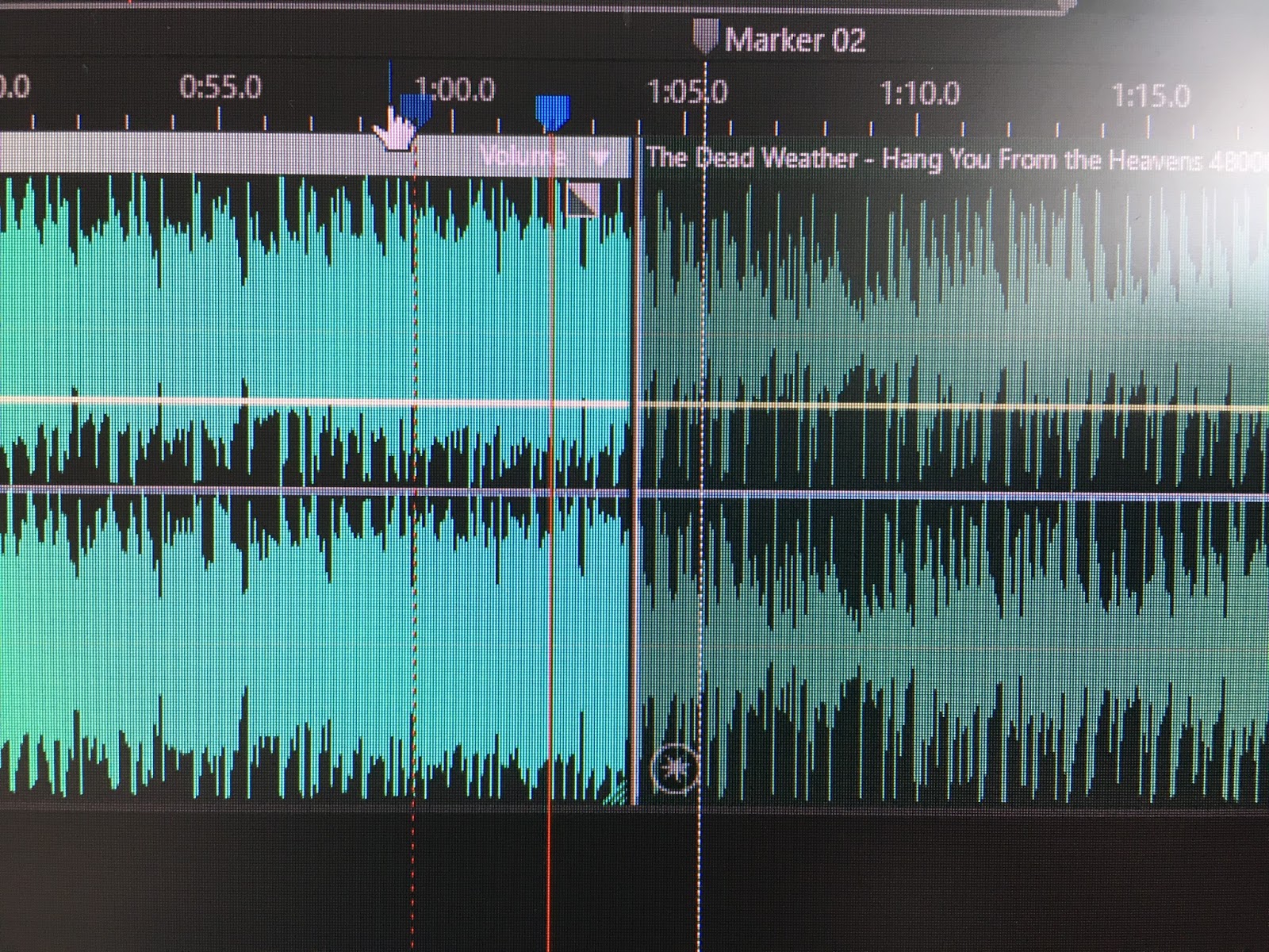
The Dead Weather - Hang You From the Heavens
But that was not it. It has a lot of lyrics and parts that were very repetitive, so I put the audio in Adobe Audition and cut it in pieces. I also add some effects on drums and edit the transitions...
I worked on levels and on stereo channels to make the video more immersive.
I actually went back time to time while I was editing the actual animation. I wanted some bits longer and some bits shorter, therefore I worked on both programs at the same time.
Next part was doing all illustrations.
I started with a bus. That's how the film starts with a young guy in an NYC bus looking for better life.
My inspiration comes from intros
Catch Me if You Can Opening Title Sequence
I liked the simple look and use of colour.
I loved the transitions the most, they are very clever and you cannot predict the next one.
Next - title sequence of Kiss Kiss Bang Bang
Position all layer in 3D space using After Effects was not challenging, I did it once with a bus and everything else was just natural. I got use to the points and axes very quickly.
I used some silhouettes of buildings to represent big city
All animations I keyed to change the speed more realistic.
Here I am changing speed for bus animation and camera
Many moving layers. starting from a wheel to the whole city.
I animated in a rhythm of the soundtrack. I like pop-up texts and seamless transitions for animation. I liked bright colors and very simple backgrounds. I used a lot of compositions, so the actual project contains 2D and 3D compositions. Some were moving, some were just stills moved by keyframes.
TITLES
I wanted very simple and visible font. I did large scale letters to be readable in time they are on the screen. Each title was replayed many times to make sure that it has on the screen for long time enough, but at the same time not for too long time. I find very annoying if titles are too long on the screen. I like that it is possible to read the text and still appreciate the animation.
I very liked the process of keyframing the camera angles. I have to say that the longest process in the whole project was the illustrator. I spent around 10 hours learning it and about the same time to make all shapes you can see in the next blog post.
I loved the transitions the most, they are very clever and you cannot predict the next one.
Next - title sequence of Kiss Kiss Bang Bang
I used some silhouettes of buildings to represent big city
All animations I keyed to change the speed more realistic.
Here I am changing speed for bus animation and camera
Many moving layers. starting from a wheel to the whole city.
I animated in a rhythm of the soundtrack. I like pop-up texts and seamless transitions for animation. I liked bright colors and very simple backgrounds. I used a lot of compositions, so the actual project contains 2D and 3D compositions. Some were moving, some were just stills moved by keyframes.
TITLES
I wanted very simple and visible font. I did large scale letters to be readable in time they are on the screen. Each title was replayed many times to make sure that it has on the screen for long time enough, but at the same time not for too long time. I find very annoying if titles are too long on the screen. I like that it is possible to read the text and still appreciate the animation.
I very liked the process of keyframing the camera angles. I have to say that the longest process in the whole project was the illustrator. I spent around 10 hours learning it and about the same time to make all shapes you can see in the next blog post.


0 comments: